
1919 → Today · Club identity
The evolution of the Leeds United badge
Explore Leeds United badge history through the changing symbols of Elland Road and the managers who shaped each era.
Historical badge illustrations: Images sourced from FootyLogos.com, except for the separately sourced 2019 centenary crest. All images are used to illustrate the history and evolution of Leeds United’s badges. Club crests and trademarks remain the property of their respective owners.
Leeds United badge history—and the history of Leeds United logos and crests—stretches from the city’s civic heraldry and the famous owl to the Smiley, Yorkshire rose and modern shield. These changing designs tell the story of the club—and the managers who shaped it. This historical guide distinguishes permanent crests from overlapping shirt designs and commemorative or proposed badges.
1919–1934: Before the First Shirt Badge
Leeds United were founded in 1919 following the demise of Leeds City. Their first shirts were blue and white stripes, and early playing kits generally carried no badge. The civic identity of Leeds would later provide the club’s first recognised shirt crest.
Managers of this era: Dick Ray and Arthur Fairclough.
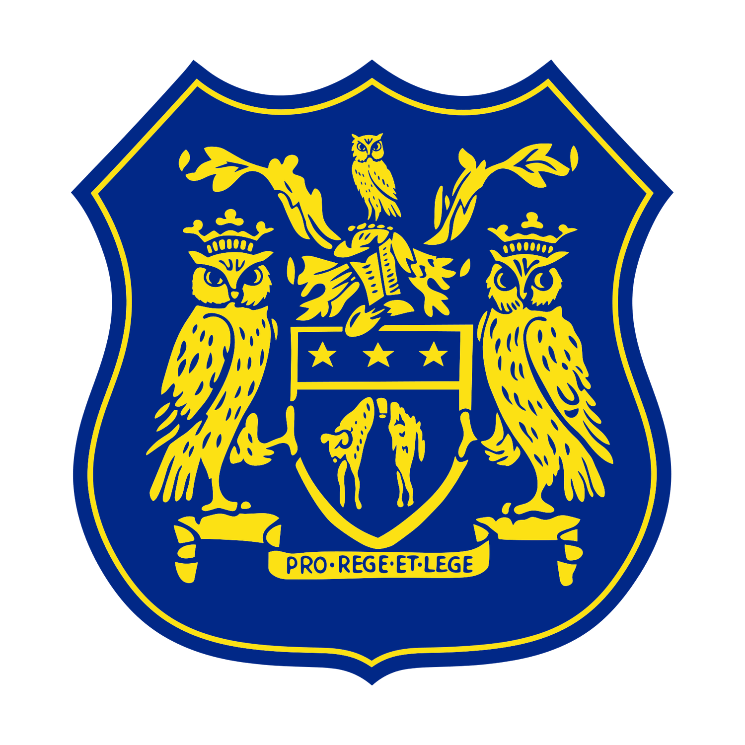
1934–1961: The City of Leeds Coat of Arms
The first recognised Leeds United shirt badge arrived in 1934. Based on the city coat of arms, it included heraldic owls and appeared in several forms through the 1950s. This is an important distinction: the civic imagery predated the simpler perched-owl badge of the Revie years.
Managers of this era: Major Frank Buckley, Raich Carter and Jack Taylor.
1961–1964: The Unbadged White Shirt
Don Revie introduced an all-white strip inspired by Real Madrid. For several seasons the plain shirt carried no crest, marking a dramatic break with the club’s blue-and-gold past.
Manager of this era: Don Revie.
1964–1972: The Perched Owl
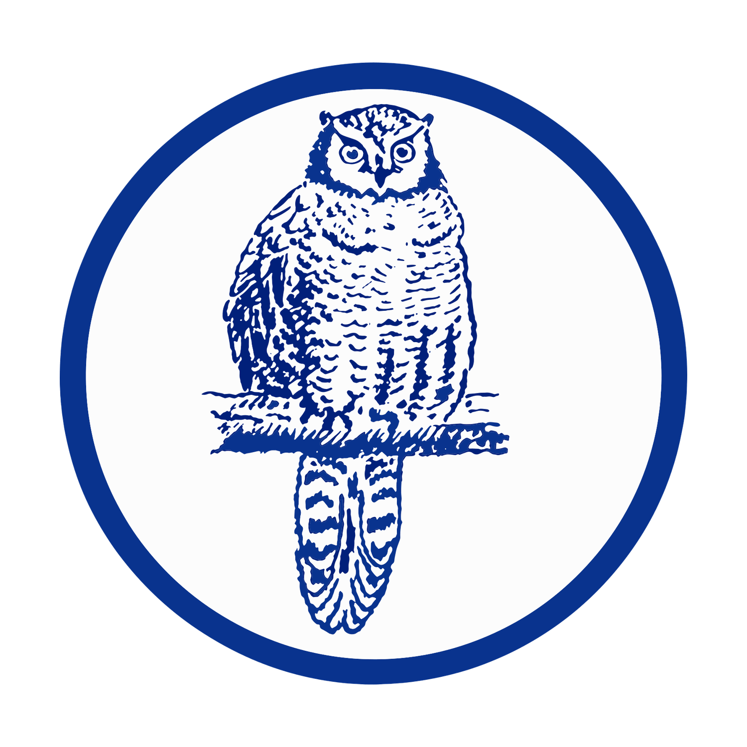
A simplified owl appeared on the shirt in 1964, recalling the owls of Leeds civic heraldry. Usually navy, it appeared in gold for the 1968 League Cup Final. Some owl designs remained in use as late as 1972, overlapping with the LUFC script.
Manager of this era: Don Revie.
1971–1973: The LUFC Script
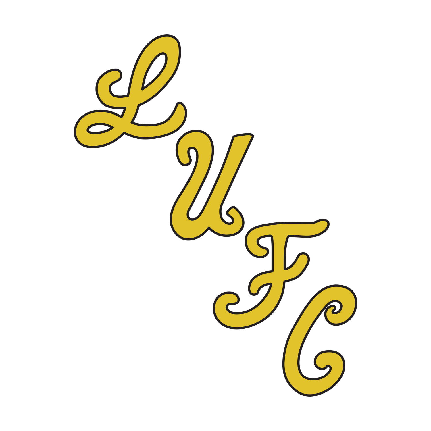
A flowing, diagonal LUFC monogram brought a modern look to the shirt and was worn for the 1972 FA Cup Final victory. The lettering later influenced the vertical initials on the shield. The transition from owl to script was not instantaneous.
Manager of this era: Don Revie.
1973–1976: The Smiley

The famous circular ‘Smiley’ ingeniously combined the letters L and U. It became synonymous with Revie’s title-winning side of 1973–74, and remained during the upheaval following his departure.
Managers of this era: Don Revie, Brian Clough and Jimmy Armfield.
1976–1981: Smiley Variations
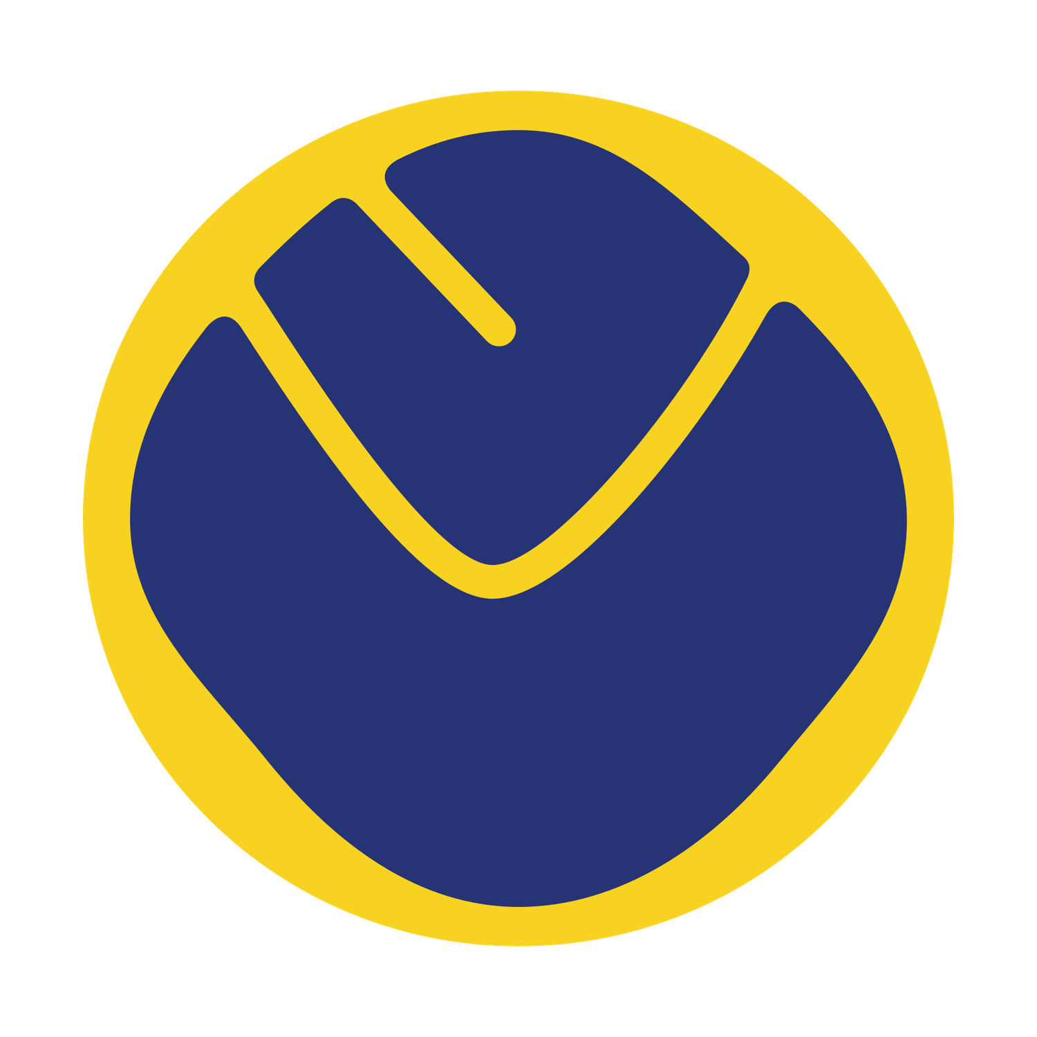
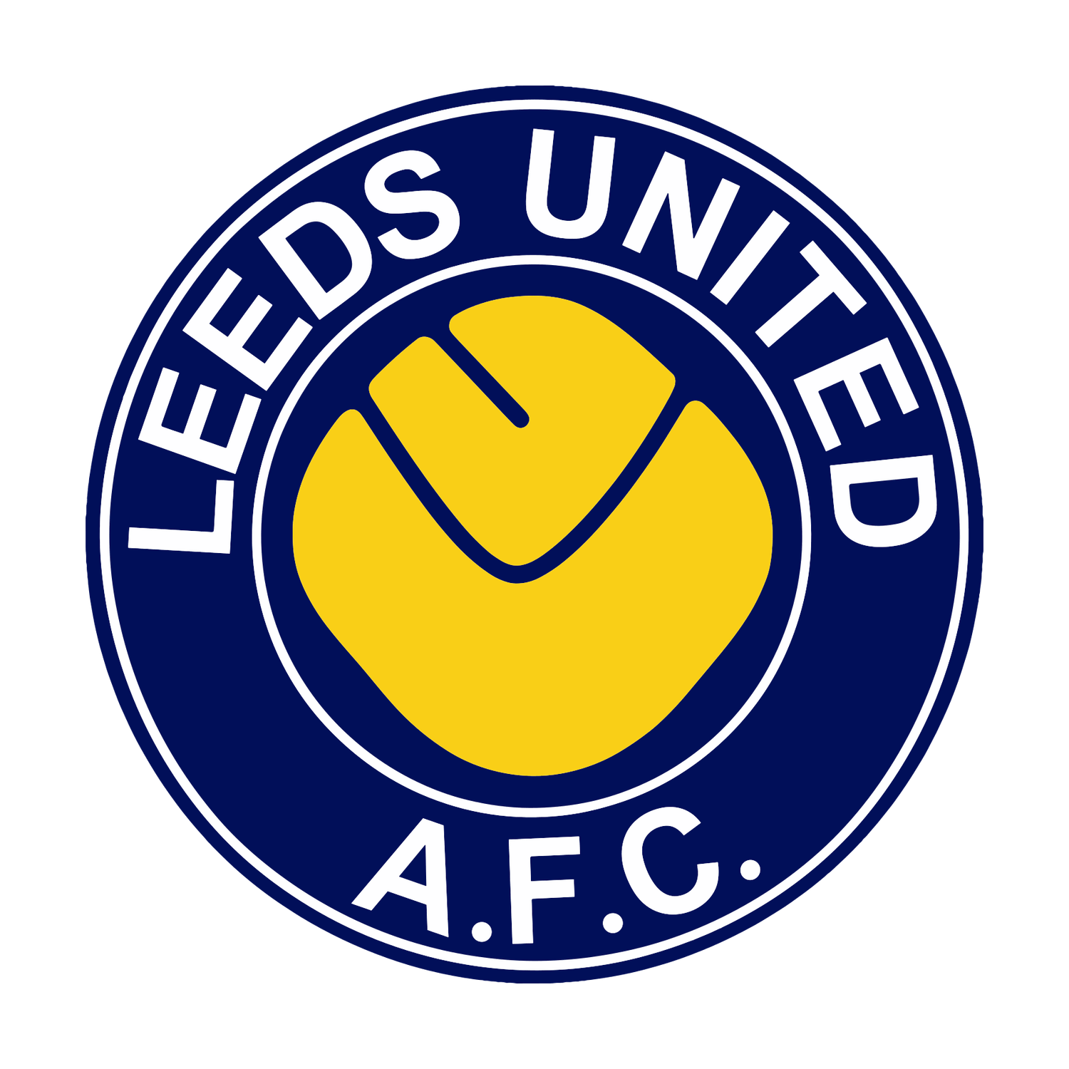
The 1976–77 badge reversed the blue and yellow of the original Smiley, producing an almost photographic-negative effect. As Robert Endeacott and Ben Hunt note in Leeds United: The Collection — A History of the Club’s Kits, some examples also varied in their rotation or orientation on the shirt. These are useful distinctions between individual shirt badges, rather than necessarily separate official crest launches. From 1977, the Smiley also appeared within a roundel bearing the club’s name. Home, away and other shirt variations sometimes overlapped, so this era is best understood as a family of related designs rather than a single abrupt replacement.
Managers of this era: Jimmy Armfield, Jock Stein and Jimmy Adamson.
1981–1984: The Peacock
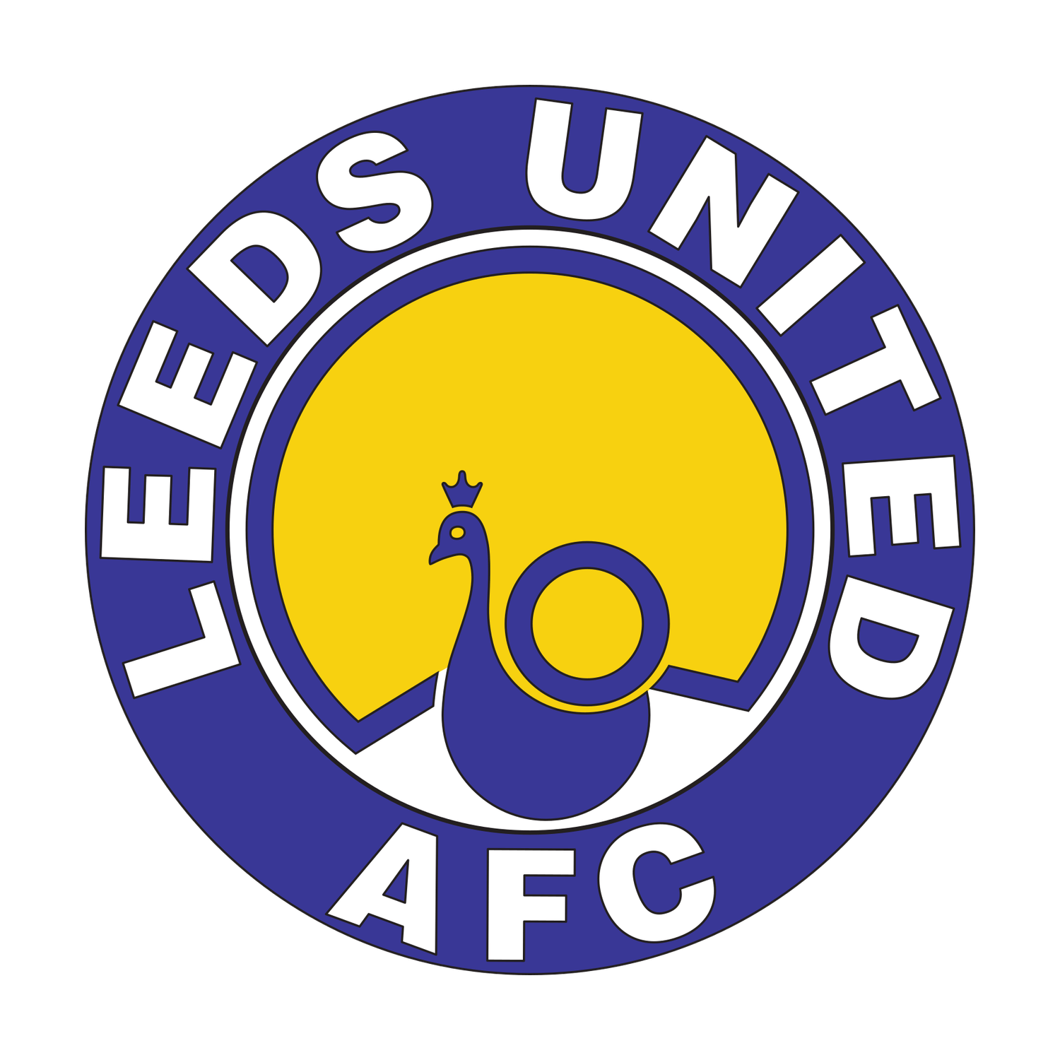
Around 1980–81, the Smiley gave way to a stylised peacock inside a circular club-name border. The bird recalled the club’s traditional nickname, linked to the Old Peacock public house near Elland Road. The badge accompanied a difficult period that included relegation in 1982.
Managers of this era: Allan Clarke and Eddie Gray.
1984–1998: The Yorkshire Rose and Football
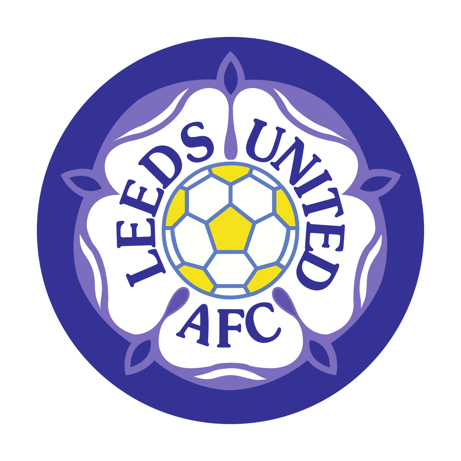
Following a supporter design competition run through the Yorkshire Evening Post, Leeds adopted a circular badge featuring a football within the White Rose of Yorkshire. Supporter Brenda Reader won the competition with a design selected by Eddie Gray and the players. It became the emblem of Howard Wilkinson’s revival, the 1990 promotion and the 1991–92 First Division championship.
Managers of this era: Eddie Gray, Billy Bremner, Howard Wilkinson and George Graham.
1998–Present: Leeds United Badge History and the Shield
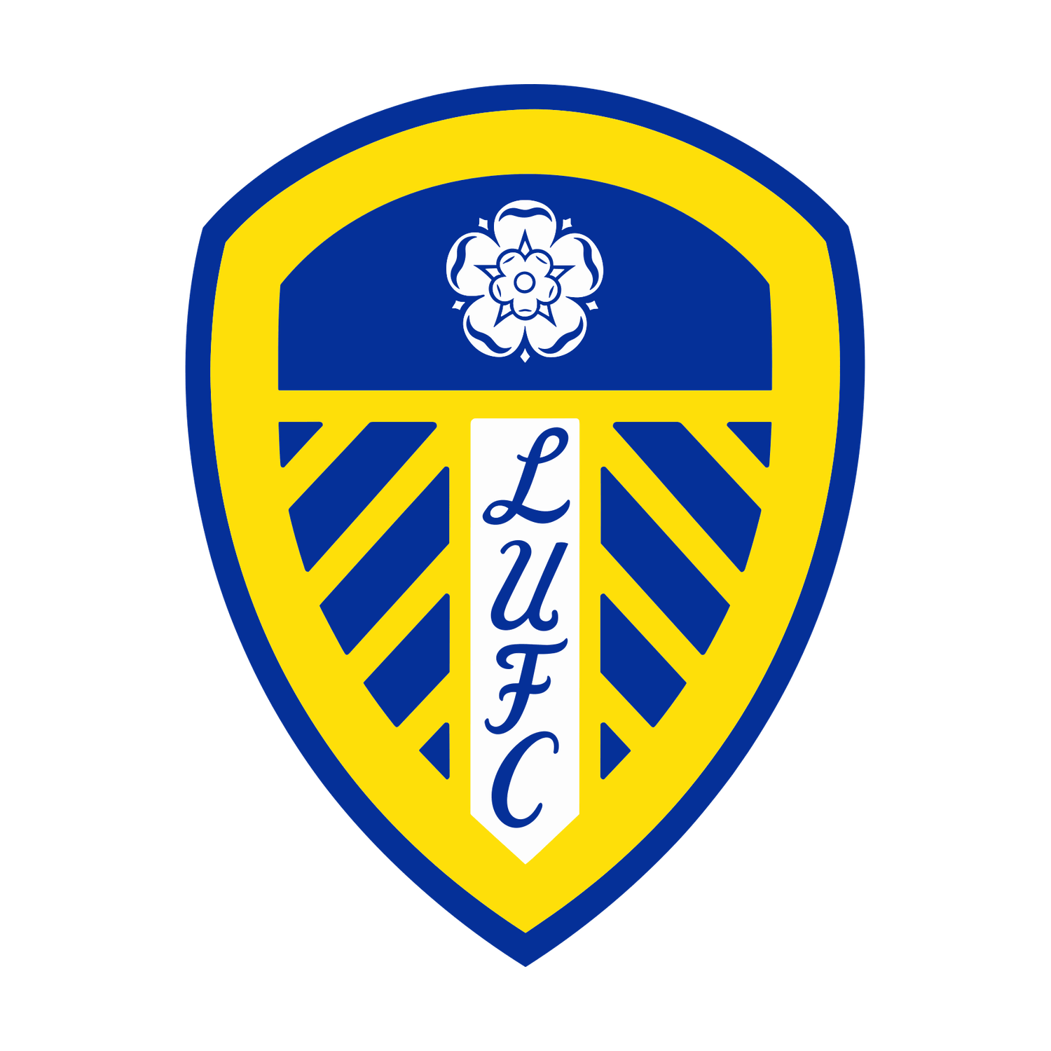
The shield introduced in 1998 brought together blue, yellow, the Yorkshire rose and vertical LUFC lettering. The original 1998 shield was subsequently refined, including changes to its colours and detailing, producing the familiar modern version. It has endured through Champions League football, relegations and Marcelo Bielsa’s 2020 promotion.
Managers of this era: George Graham, David O’Leary, Simon Grayson, Marcelo Bielsa and Daniel Farke.
2018: The Rejected Leeds Salute
In January 2018 the club unveiled a proposed crest featuring a figure making the Leeds Salute. Supporter criticism prompted the club to reopen consultation; the design was never adopted on match shirts. It belongs in the history as a proposed badge, not a period of official use. Sources: Leeds United’s original 2018 announcement (archived) and BBC Sport’s contemporary report.
Manager of this era: Thomas Christiansen.
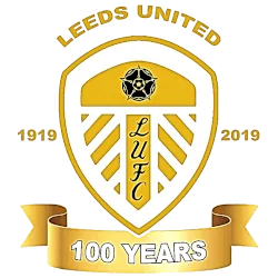
2019–2020: The Centenary
For the 2019–20 centenary season, Leeds introduced a special gold treatment of the shield, with 1919 and 2019 dates and a 100 Years banner. A limited-edition centenary shirt also featured a gold crest. The special centenary crest was a commemorative design rather than a replacement for the club’s permanent shield. The centenary season culminated in the Championship title and promotion under Marcelo Bielsa.
Manager of this era: Marcelo Bielsa.
Leeds United Logos, Badges and Crests: What’s the Difference?
Supporters often use Leeds United logo, badge and crest to mean the same thing: the design that represents the club. There are small differences in emphasis, though. A logo is a broad term for a visual identity, including a symbol or lettering such as the LUFC script. A badge is the emblem worn on a football shirt, while crest often suggests a more traditional, heraldic design, like the early civic coat of arms.
Across Leeds United’s history, the owl, Smiley, Peacock, Yorkshire rose and shield have all served as recognisable club identities. Some designs appeared in different colours or on different shirts, and the proposed 2018 Leeds Salute was never adopted. Whether you are looking for old Leeds United logos, historical shirt badges or the evolution of the club crest, the gallery above brings these related designs together in one place.
Sources and further reading
- Robert Endeacott and Ben Hunt, Leeds United: The Collection — A History of the Club’s Kits (see “The crest part five”).
- MyLearning: Leeds United Kit
- The Beautiful History: Leeds United
- Premier League: Club badges explained
- BBC Sport: 2018 crest consultation
- Footy Headlines: 2019 centenary kit and gold crest
Editor’s note: Badge dates sometimes overlap because home, away and special-occasion shirts could use different designs. Historical dates may vary between shirt versions; image reproduction rights remain subject to confirmation.